Build an interactive cooling system schematic (no code)
Dec 07, 2025 · 10 min readTurn a static cooling loop diagram into a live, clickable data center schematic with status lights, color-coded pipes, and popups, without writing any code.
Intro
Monitoring a cooling loop usually feels like a scavenger hunt. You have real-time data in your SCADA or BMS, but the actual system context - the diagrams - are often just static PDFs or screenshots buried in a SharePoint folder. You’re constantly translating spreadsheet numbers into physical reality in your head.
Let’s bridge that gap. In this guide, we’ll replace those static drawings with a living schematic. We’re putting racks, pumps, chillers, and towers on one canvas, with status lights that actually change.
We’ll start from a static image and, using only MarkerKit’s visual editor, add hotspots, bind them to JSON data for temperatures and status, and wire up popups with live metrics. No custom front-end code, no custom canvas logic.
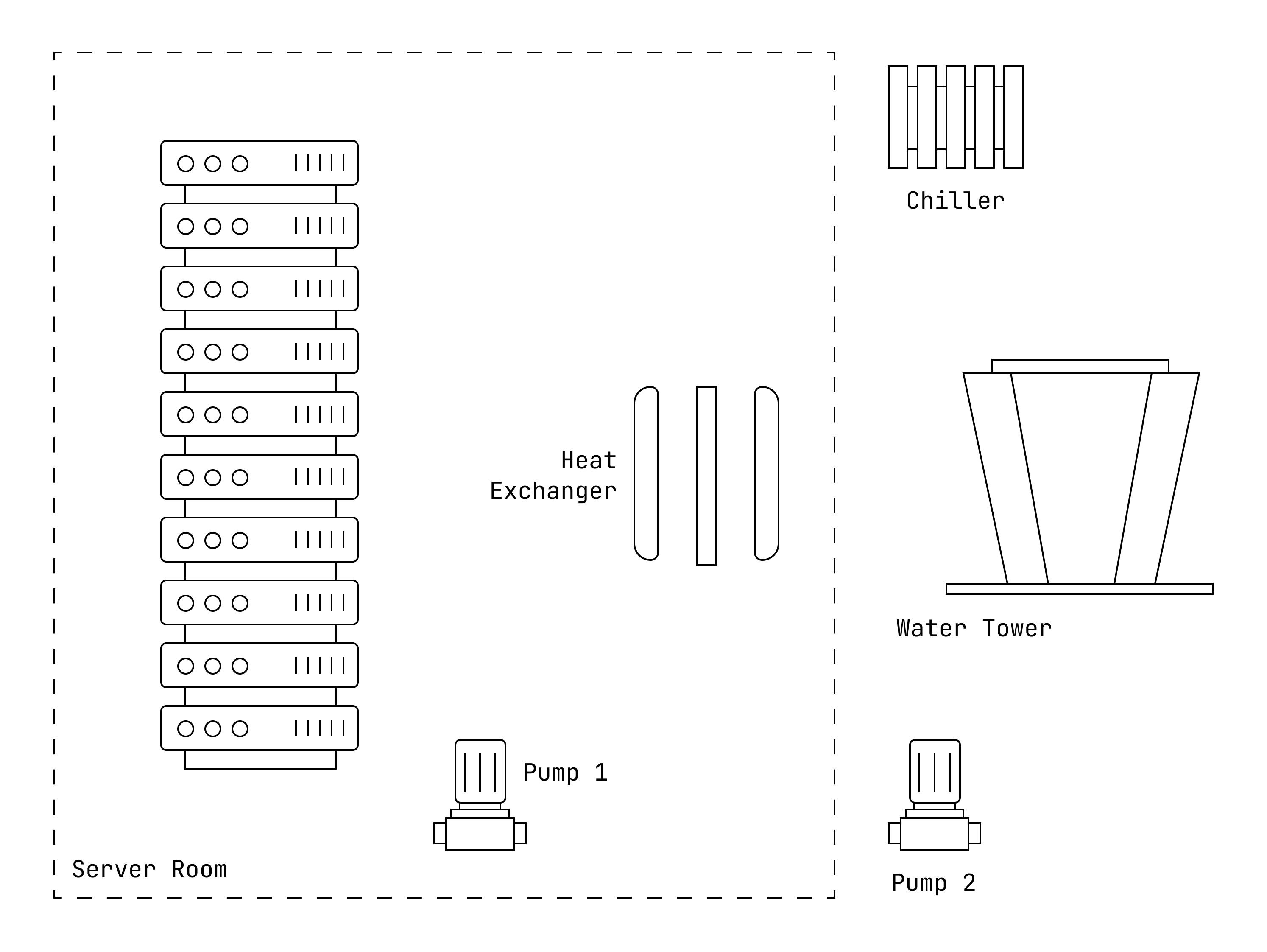
1. Create your project and add the base image
Start by creating a new project in your Dashboard. Choose Image as a starter template and upload the image you want to use as the base for your cooling loop schematic. This could be anything from a simplified process diagram to a full P&ID exported from your design tools.
For this example, we’ll use the following image as the starting point for our interactive dashboard:
2. Draw hotspots for equipment and pipes
The first step in turning your static diagram into an interactive cooling dashboard is to draw hotspots where you want to add interactivity. Head over to the Objects tab and press P or click the Polygon tool in the toolbar.
In this example we’ll demonstrate the process for a single server and a pipe. That’s enough to show the pattern for a live rack diagram, and the process remains the same for additional pumps, pipes, or pieces of equipment.
Map the server object
For the server, start by drawing a hotspot for each indicator light. Select each one and set the color to green, yellow and red. The opacity should be set to zero, and we’ll modify the visibility later when we connect live data. Disable Interactive as well, since we only want to show the status without any popups.
Finish by drawing a hotspot around the entire server. Set the opacity to zero, but keep Interactive enabled, since we’ll add a popup to this object later. Additionally, we can set hover effects to make it more obvious that the object is highlighted when we hover over it with the mouse, or tap it on a touchscreen device. Set the following styles:
- Hover Opacity: 0
- Hover Stroke Width: 2
- Hover Stroke Opacity: 1
- Hover Stroke Color: black
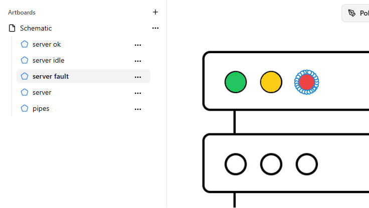
As a final step for the server, set a name for each object so we can identify them later when we connect live data from our cooling system. You can do this by selecting the object and modifying the Name field in the sidebar on the right.
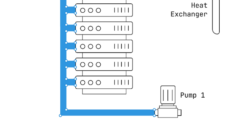
Draw the pipe segment
You might have noticed that in the starter image there is no pipe, because we’ll use only the hotspot to represent it. You can either eyeball the shape, or temporarily replace the background image with an image that includes the pipe. Draw the polygon where you want the pipe to be, and set the opacity to 1. The color doesn’t matter, because we’ll be modifying it dynamically depending on the temperature.
Finally, give the pipe object a clear name (for example,
3. Connect live data to your schematic
So far, everything is static. To turn this into a real data center cooling dashboard, we need to wire the diagram to live data: status values, temperatures, and flow.
In MarkerKit that happens through Data Binding. You can point it at any JSON source—an internal API in front of your BMS / SCADA, a simple microservice, or even pasted sample JSON while you prototype the schematic.
How Data Binding works in MarkerKit
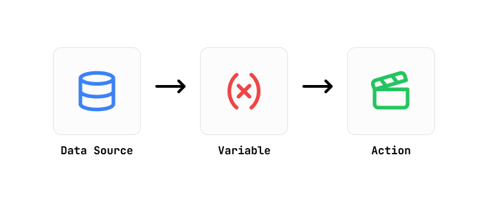
The Data Binding system in MarkerKit lets you take any JSON and bind specific values to object properties in your project. That’s how we turn a static cooling loop drawing into a live, interactive schematic.
There are three main concepts:
Data Sources – Where your data comes from. This can be an API endpoint that returns JSON, or static JSON that you paste directly into MarkerKit.
Variables – Pointers to specific values inside that JSON. You define them with JSONPath expressions and can also perform calculations, like math expressions or color interpolation.
Actions – Rules that say when and how to update objects based on your variables. An action might change opacity, color, or text; or even create new objects dynamically from data.
We’ll use these three pieces to drive the server status lights and color the pipe by temperature.
Create a data source for your cooling loop
In this example we’ll use a greatly simplified JSON structure to represent server status and temperatures. In a real deployment, this could come from your monitoring stack or a small API that normalizes data from different systems.
Head over to the Data Binding tab and create a new Data Source. Choose Custom JSON as the source type and paste the JSON into the editor. This gives you a simple “virtual” API you can use while building the schematic.
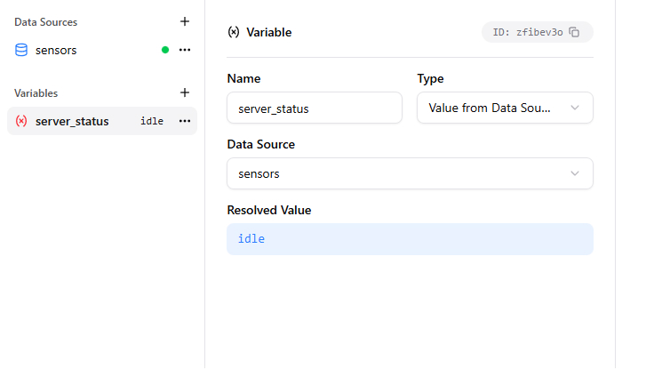
Drive the server status indicators
Right now our three indicator objects are transparent. The goal is to take the server status from the JSON and set the opacity of the corresponding indicator to 1, so the schematic behaves like a live rack status panel.
Create a new Variable and name it
Next, create three Actions, one for each indicator light. We’ll name them
The last step is to apply this action only when the server status is
- Variable: server_status
- Operator: ==
- Value: normal
Repeat the same process for the yellow and red indicators, changing the object and condition values accordingly (
As you make these changes, you should see a preview of the cooling schematic updating in real time on the right. Alternatively, you can head over to the Preview tab to see how it looks. Updating the JSON in the Data Source editor should immediately reflect in the rack indicators.
Color the pipe based on temperature
For the pipe, we want to change its color based on the temperature value from the JSON—so you can read the cooling loop at a glance.
Start by creating a new variable named
Next, we need to generate a color based on the
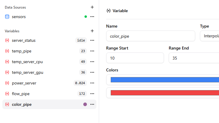
Configure the interpolation range however you like (for example, blue for cold water, red for hot). This gives you a single variable that always resolves to the correct color for the current temperature. For range, we used 10°C (blue) to 35°C (red).
Now we want to apply that color to the pipe object. Create a new Action named
At this point, changing the
4. Add popups for live metrics
So far the schematic shows state visually—status lights and colored pipes. To make it more useful for operators, we can add popups that display exact numbers when someone hovers or taps.
In this example, we’ll add a popup to the server object that shows CPU and GPU temperatures, as well as power draw. For the pipe object, we’ll show flow rate and temperature.
Head over to the Popups tab and create a new popup named
Note: Popups are independent of objects, so you can create them first and then assign them to objects later. That way you don’t need to re-create them if objects change.
Select the server object as the target. In the Text Content field, you can use HTML to format the content. Keep the same HTML snippet you used in the original draft, with placeholders like
Those placeholders reference variables you created earlier, enclosed in curly braces. They’re replaced with actual values from the JSON data when the popup is displayed, giving you a mini data center dashboard directly on the schematic.
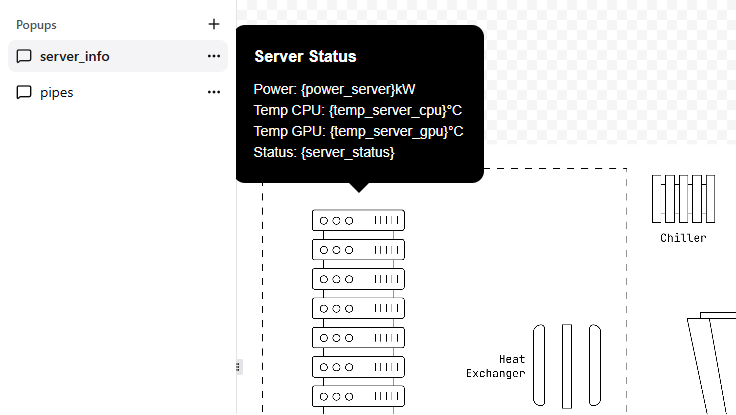
Finally, create a popup for the pipe as well. Make a new popup named
5. Embed the interactive schematic on your site
When you’re happy with the result, head over to Settings → Embed Code and copy the
You can drop the snippet into a simple HTML page, a custom portal, an internal NOC view, or any web app that needs a live data center cooling schematic. Use the same embed example you already have in the draft.
Conclusion and next steps
We’ve only scratched the surface with a single rack and pipe, but you can see the potential. The core loop is simple: draw a hotspot, bind it to your JSON, and define the rules.
From here, you can connect real API endpoints and expand the canvas to cover your entire facility. This doesn’t stop at cooling loops. Use it for power distribution, water treatment, or floor utilization. It’s the fastest way to get a custom, interactive dashboard in front of your team without getting bogged down in custom development.
Turn your static images, maps, and diagrams into interactive experiences.
Get started with MarkerKitNo credit card required.
floor plans, and diagrams.